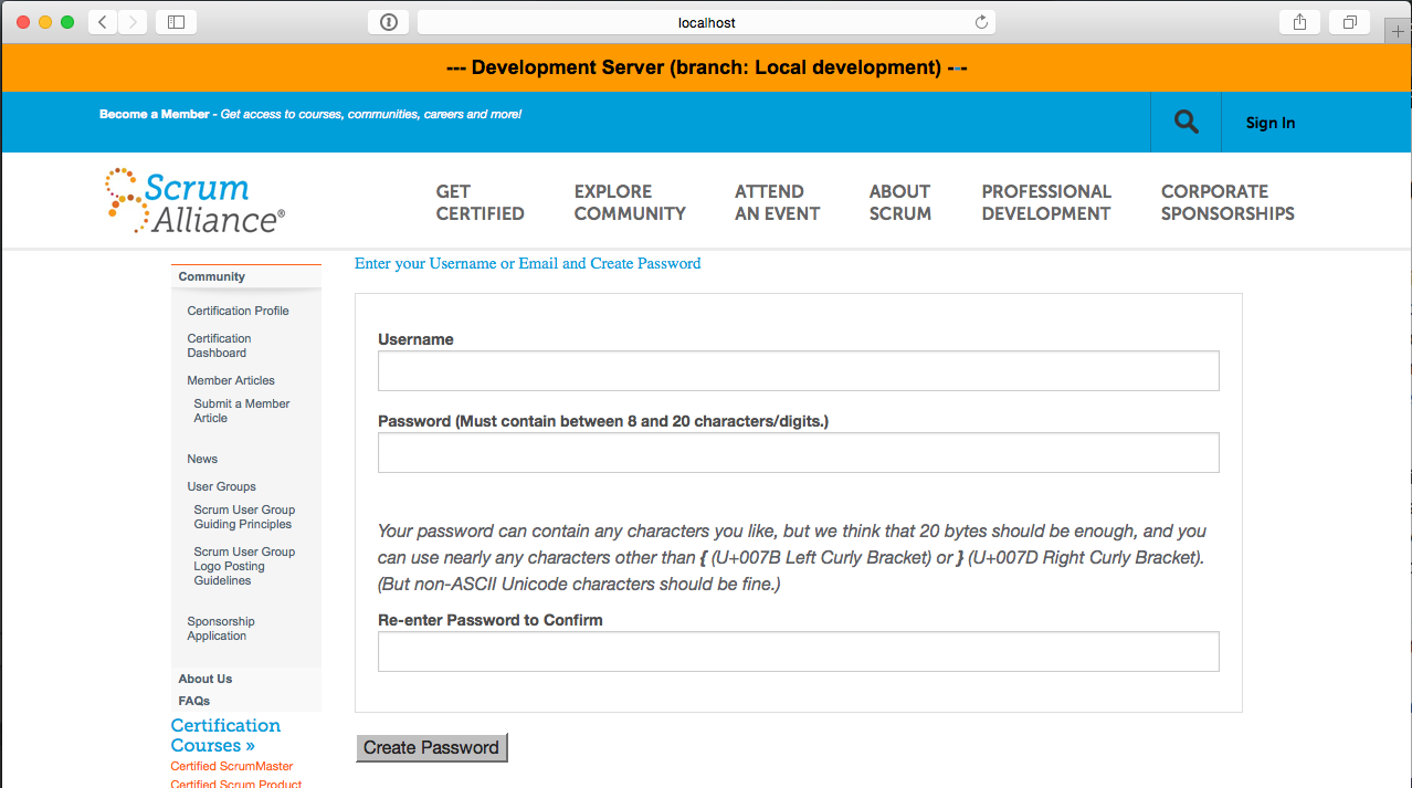
In order to determine exactly what the initial user experience is really like, I set out to document the process. I only really saw this once a few years ago and I was already familiar with the system's internals at the time so I doubt that I paid very much attention.
Upon clicking the link in the first email received from Scrum Alliance—the
“Welcome CSM”—the new user is presented with this page:
I immediately see some simple ways to improve this:
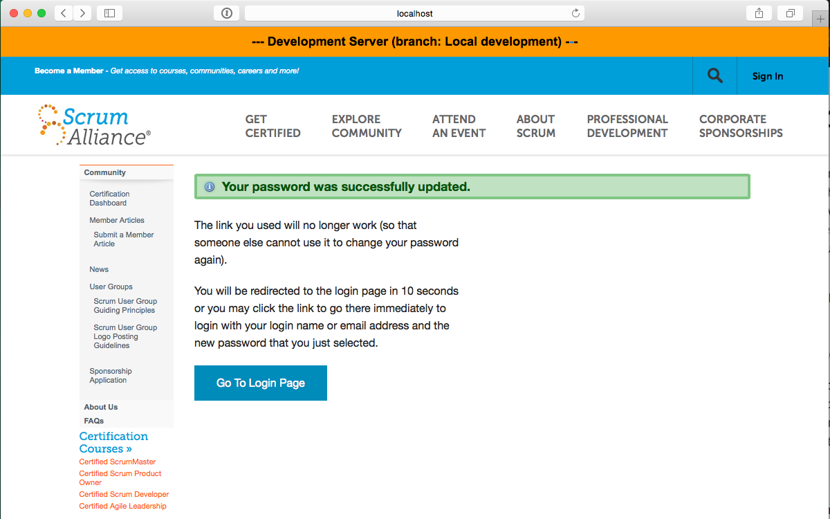
After showing that the password was successfully updated (I'm not trying to show all the
error-paths like when the entried didn't match), we explain that the link won't work again
and that they can now proceed to the login page (and they will be taken there in 10 seconds
if they don't click the link themselves).
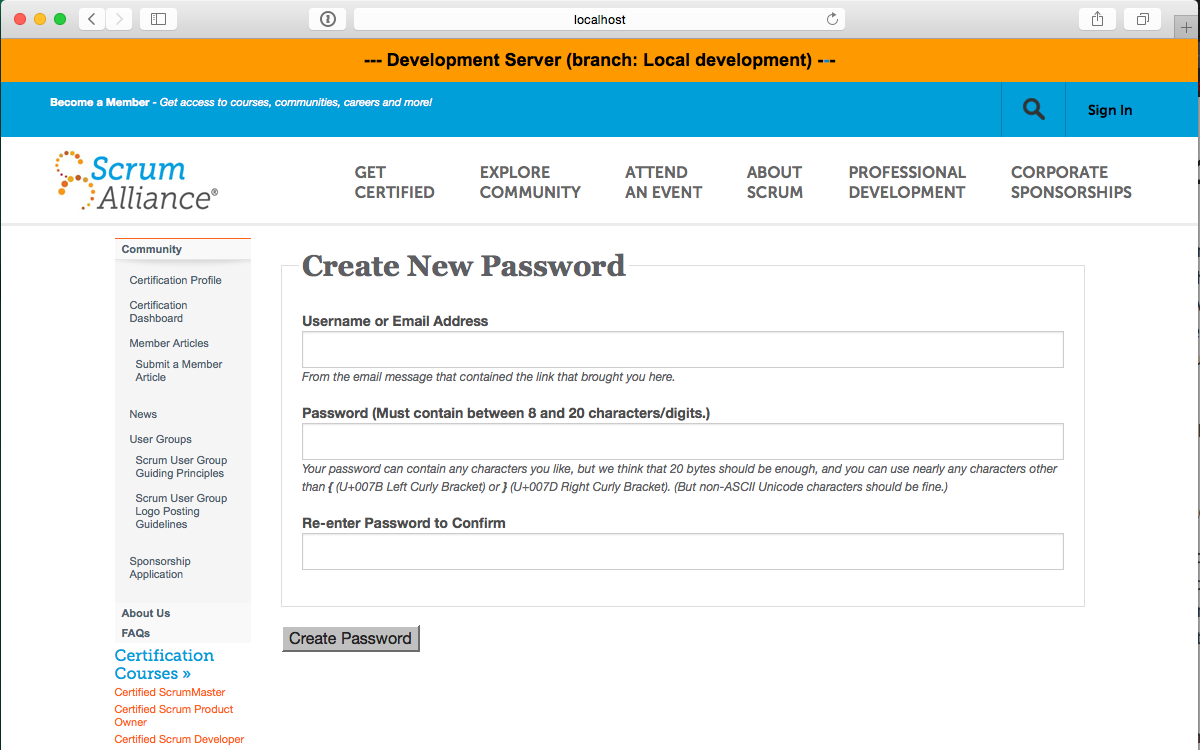
Yeah, this isn't the Kentio login page because I'm running on my local development
environment. (If you hadn't already noticed that from the big orange banner at the top.)
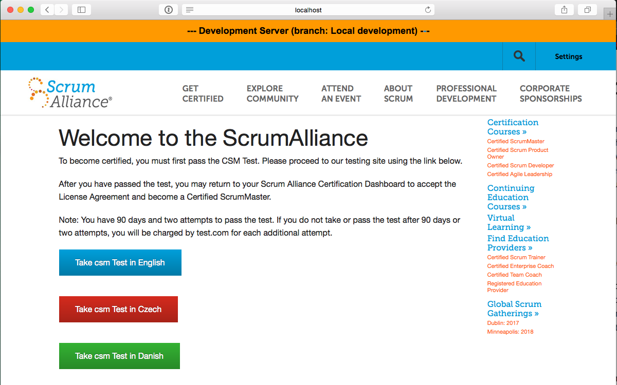
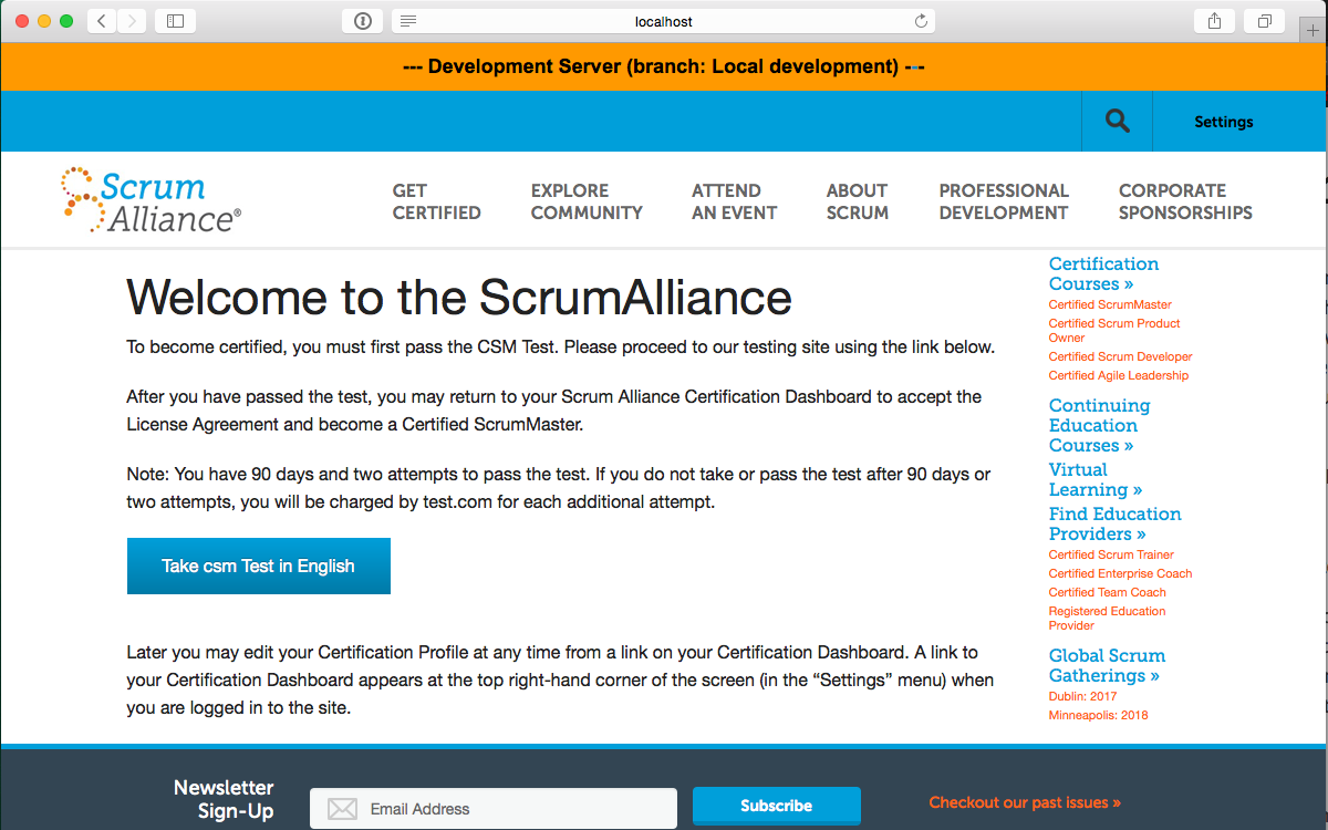
Since I faked a student in a CSM course, my Welcome page tells me to "Take csm Test in
…" and so I select "English" …
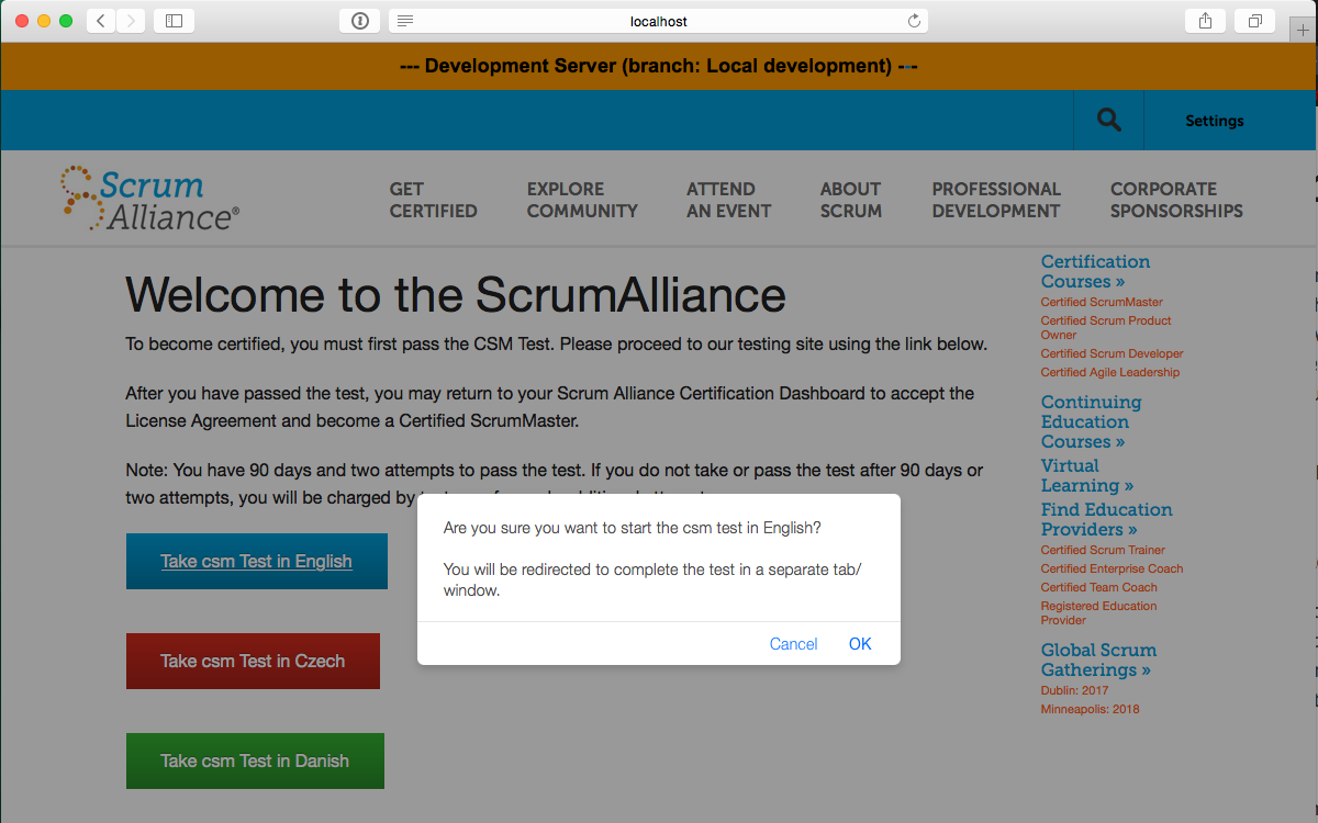
… and get this nice little warning (at least in Safari which I used for this process,
but I normally use Chrome).
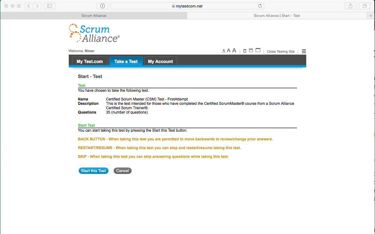
(and, oops!, it really goes to test.com and creates an ftimer username there)
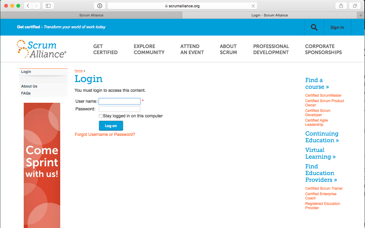
When I closed the testing site, naturally, I'm sent back to production because
there's no way for test.com to know that I'm just testing.
Since my original tab is still open (remember the warning about a new tab?), I try refreshing it:
OK, so I have to fake a passing test result being posted against my local environment …
 $ curl -D - "http://localhost:3000/test_results/test.com/ftimer/csm1/?userid=680277&userlogin=ftimer&username=ftimer&useremail=f%2Etimer%40sample%2Ecom&testid=52624&testlookupcode=csm1&testoptiontext=Test&testname=Certified%20Scrum%20Master%20%28CSM%29%20Test%20%2D%20FirstAttempt&testtakendatemonth=8&testtakendateday=31&testtakendateyear=2017&testtakendatehour=14&testtakendateminute=10&testtakendatesecond=32&testtakenscore0=&testtakenscore1=PASS&testtakenscore2=33_points_scored_(or_94^3%25)_out_of_35_maximum_points&testtakenscore3=(a_score_of_66^0%25_or_greater_is_needed_to_pass_this_test)&takenuserscore=33&takenmaxscore=35&takenpassscore=66&takenispass=1§ionSummary1=general2|roles2|meetings2|artifacts2§ionSummary2=7|21|4|3§ionSummary3=7|20|4|2"

HTTP/1.1 200 OK
X-Frame-Options: SAMEORIGIN
X-XSS-Protection: 1; mode=block
X-Content-Type-Options: nosniff
Content-Type: text/html
Cache-Control: no-cache
X-Request-Id: 85863354-d5d3-49c8-a0e5-4322e23bf9c0
X-Runtime: 1.836625
Connection: close
Server: thin
And locally process the background jobs that get created (which includes sending of email).
$ rails jobs:workoff

[Worker(host:Rob-MacMini.local pid:97969)] Starting job worker
[Worker(host:Rob-MacMini.local pid:97969)] Job ActiveJob::QueueAdapters::DelayedJobAdapter::JobWrapper (id=114815) (queue=mailers) RUNNING
[Worker(host:Rob-MacMini.local pid:97969)] Job ActiveJob::QueueAdapters::DelayedJobAdapter::JobWrapper (id=114815) (queue=mailers) COMPLETED after 2.2407
[Worker(host:Rob-MacMini.local pid:97969)] 1 jobs processed at 0.4292 j/s, 0 failed
[Worker(host:Rob-MacMini.local pid:97969)] No more jobs available. Exiting
So now I can check my email!
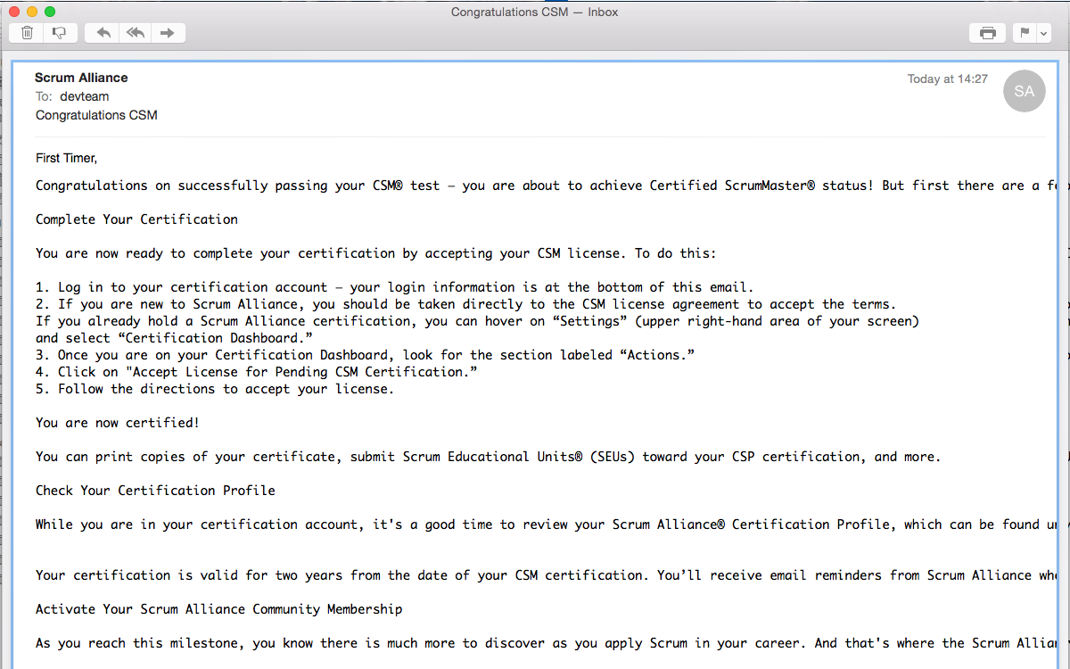
Since my Mail.app helpfully puts this email in the same pseudo-thread as my "real" email
from years ago, I can see that the formatting is pretty crappy. (Yes, that's my techincal
opinion about it.)
Now logging in after I've "passed" the test and received my Congratulations CSM email, I am presented with the Certified ScrumMaster Agreement (I've read it several times before, so …)
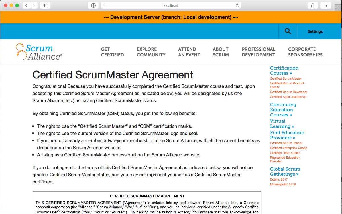
 The short paragraph of text is a bit strange, but it does seem to tell me to find the
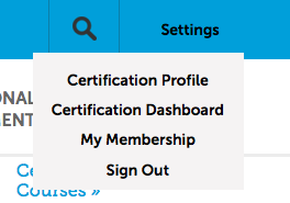
"Settings" menu and ther will be a "Certification Dashboard" link there.
The short paragraph of text is a bit strange, but it does seem to tell me to find the
"Settings" menu and ther will be a "Certification Dashboard" link there.
I accept the license agreement and am again welcomed to the Scrum Alliance.
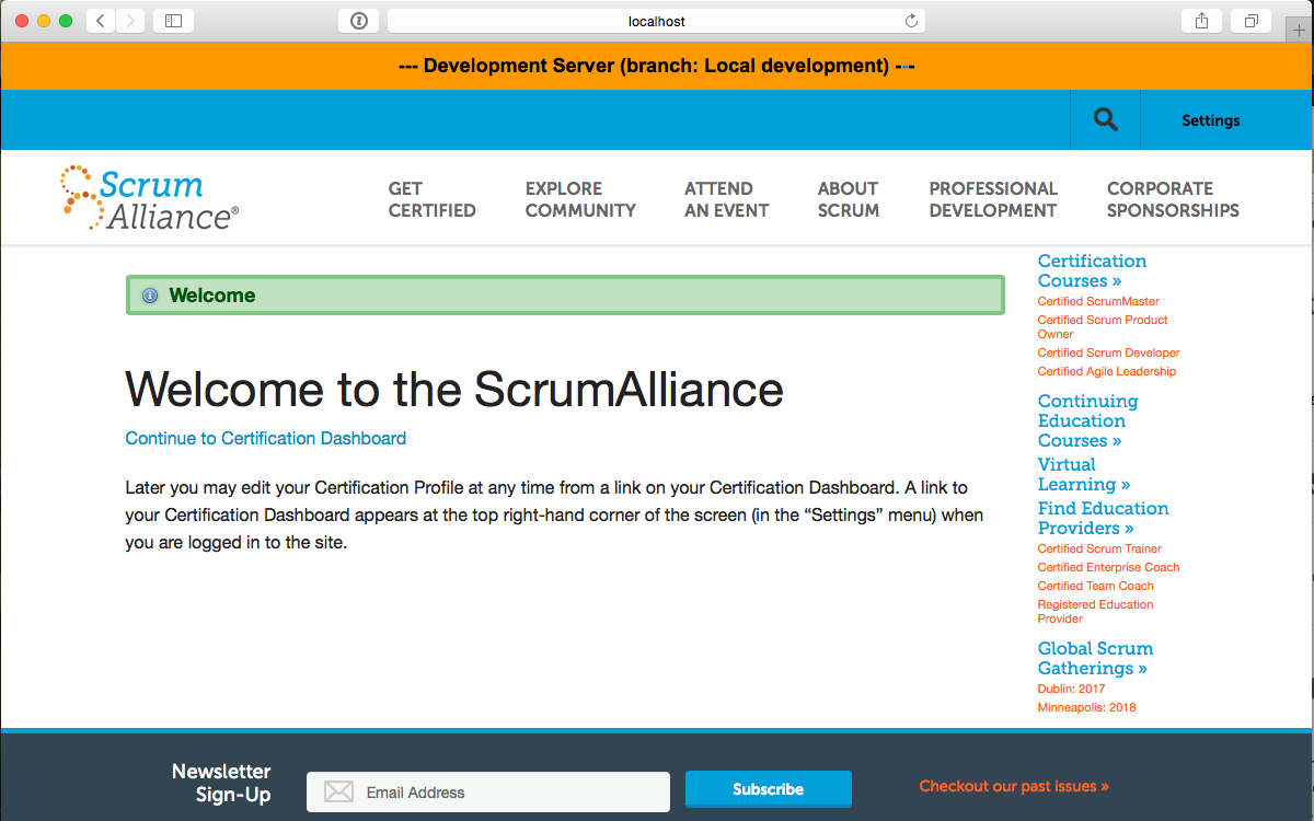
Note that there's also a link to "Continue to Certification Dashboard" that might not even be recognized as a link. Up to this point in the new user's experience with the Scrum Alliance web site, clickable things have looked like rectangular, colored areas. Well, except for the Safari dialog box that did have those plain, blue "Cancel" and "OK" choices. The "link" reads more like an instruction than an action. At the very least, this link should be formatted as a normal web link (i.e., underlined and blue) or placed as a large, colored rectangle after the text.
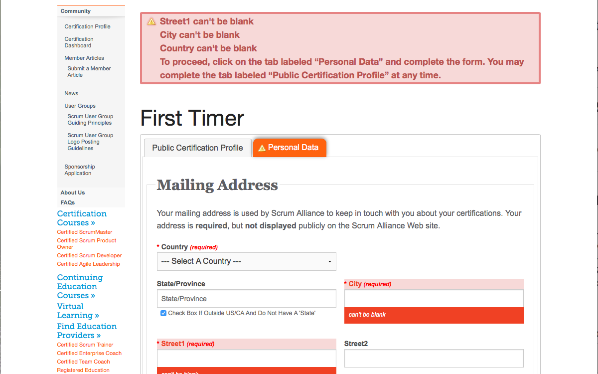
But a new user never actually goes to their Dashboard!
Perhaps the "Wecome" page previously should instead explain that the next step is to
complete one's address so it isn't so startling. Is this turning people away from the site? Even
the message is a bit misleading as the "Personal Data" tab is already the selected one and
does not need to be clicked.
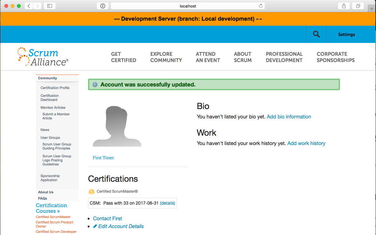
So, after completing my address information, surely I'll get to see my Dashboard, right?
What?! This still isn't my Dashboard? It's my Profile? I don't
even know that that is! (And, of course, in production this would be presented from Kentico.)
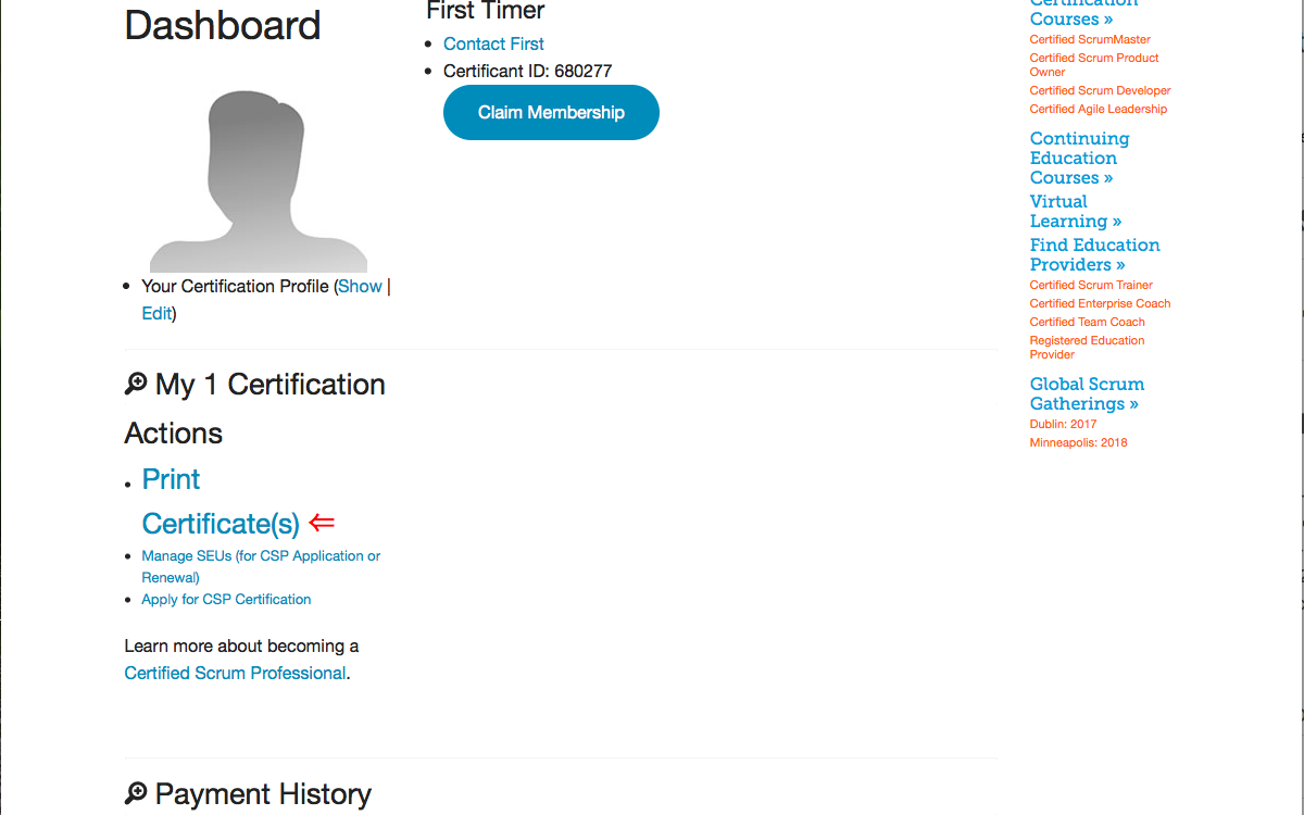
Finally, I manually find that "Settings" menu and click my "Certification Dashboard". (I've
lowered my screenshot a bit in order to capture the full page between the header
and footer.)
If what Steven says is true—that no one even reads the messaging on the early pages—then the experience is certainly worse that it would appear from my walkthrough above. The question becomes what should we do to really improve the experience? Given that there is an effort already underway to redesign the Dashboard (and have it presented via Kentico rather than Rails), any implementation steps should take that into account. Along with the observations interspersed above, here are my thoughts.